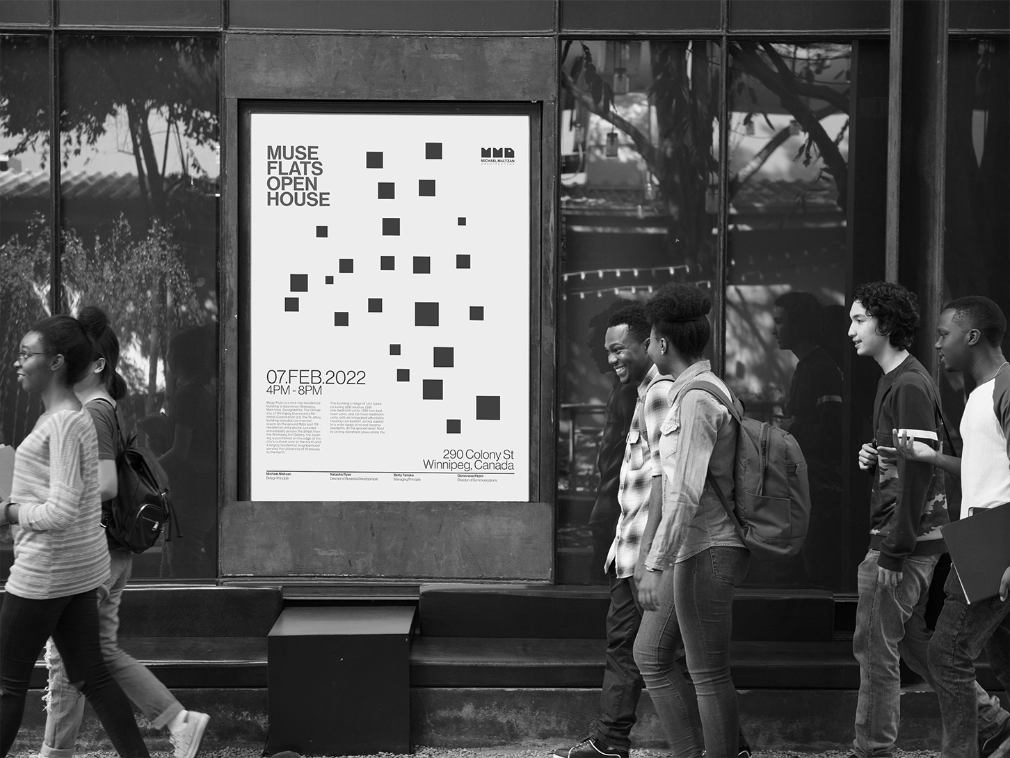
Michael Maltzan Architecture is an LA based firm which focuses on enhancing the relationship between user
and built environment. The brand explores both the complexity and possibility which is inherent in
architecture, and continuously pushes the boundaries of design.
For my project I chose to redesign the Michael Maltzan Architecture brand identity by focusing on
understanding which design elements embody both the brand essence and design aesthetic. I studied their
different works of architecture and fundamentally broke them down to understand what makes the brand unique.

Concept Development
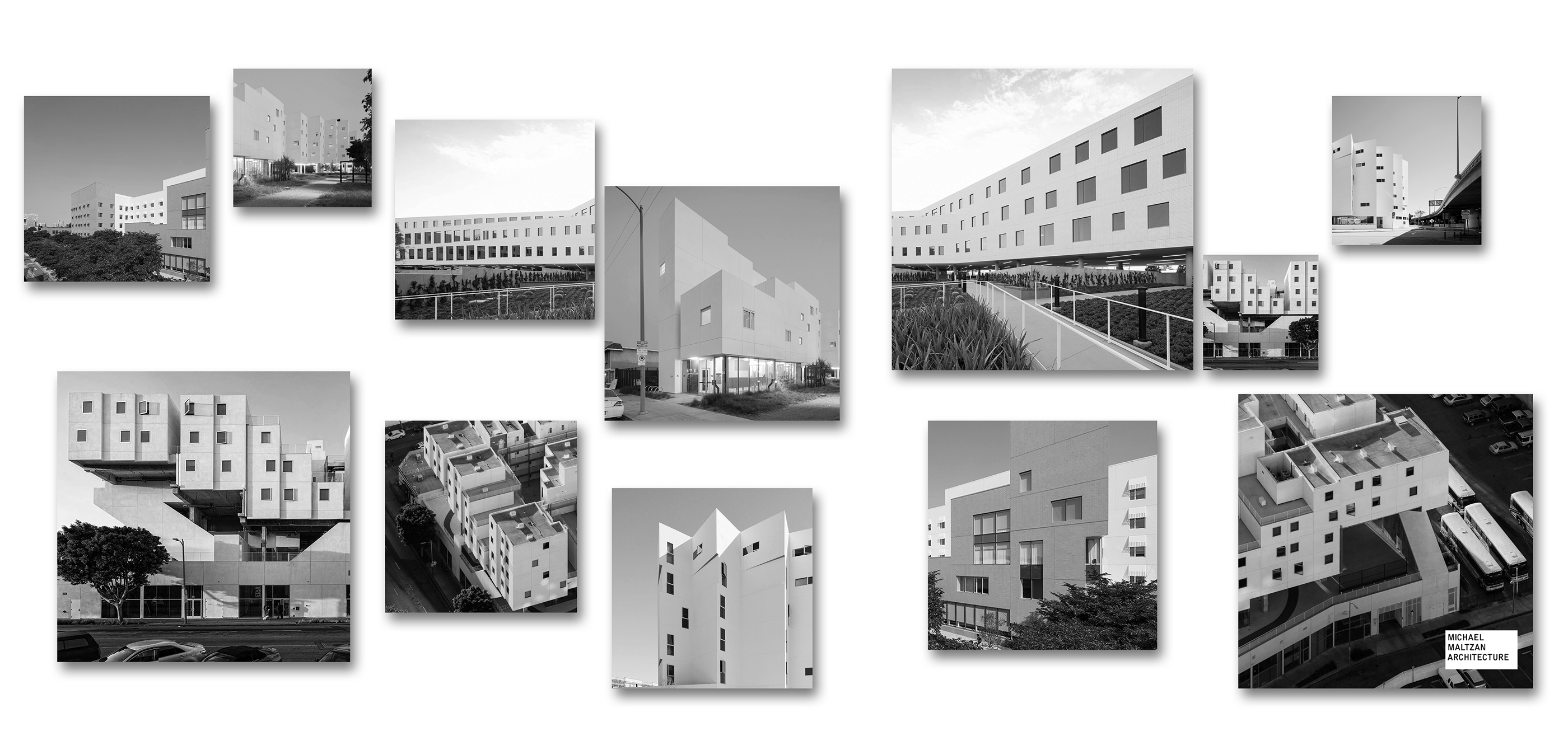
Designs by the Michael Maltzan firm are modern, dynamic, and thought provoking.
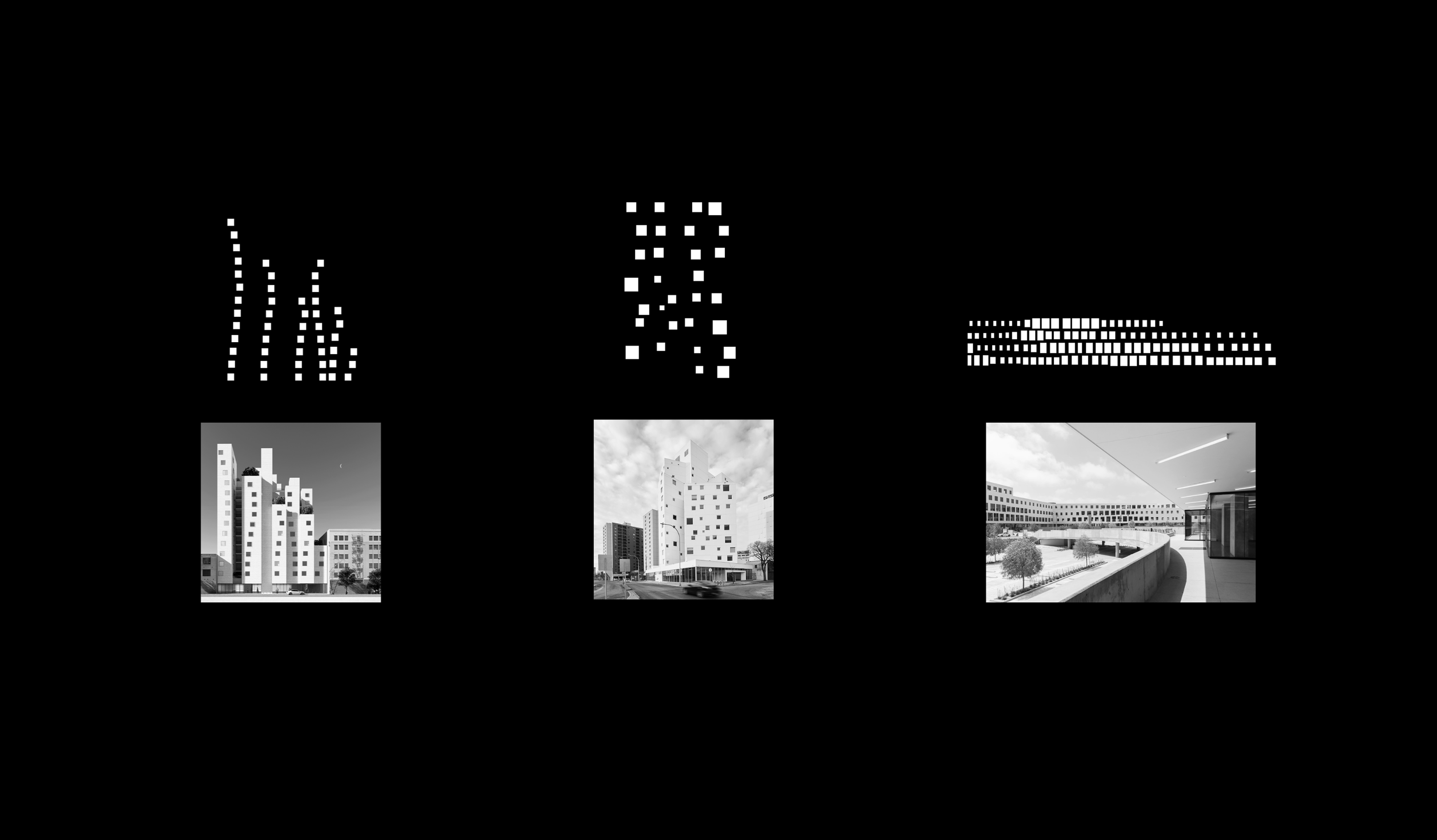
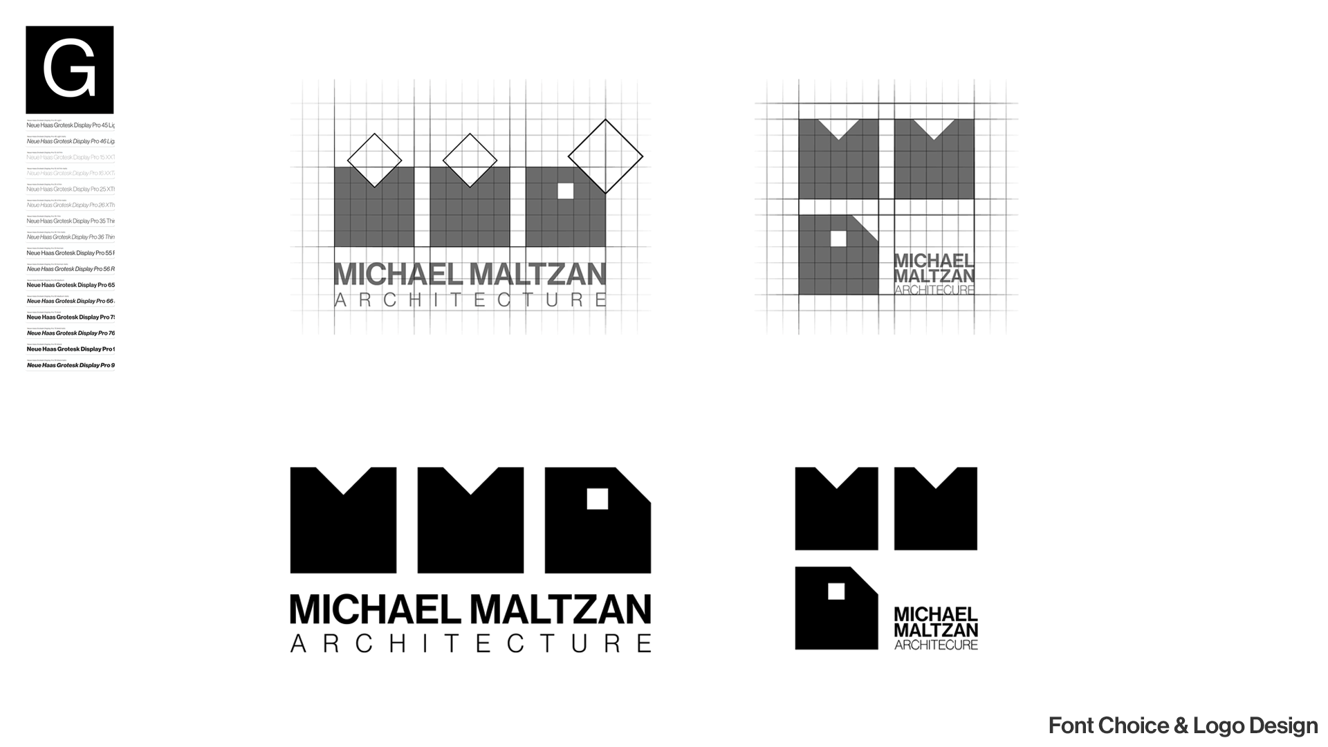
Their work heavily relies on squares, rectangles and right angles.
Their designs emphasize and rely on their iconic window layout and design.
The lack of uniformity in their window layout draws the user's attention and heightens intrigue.
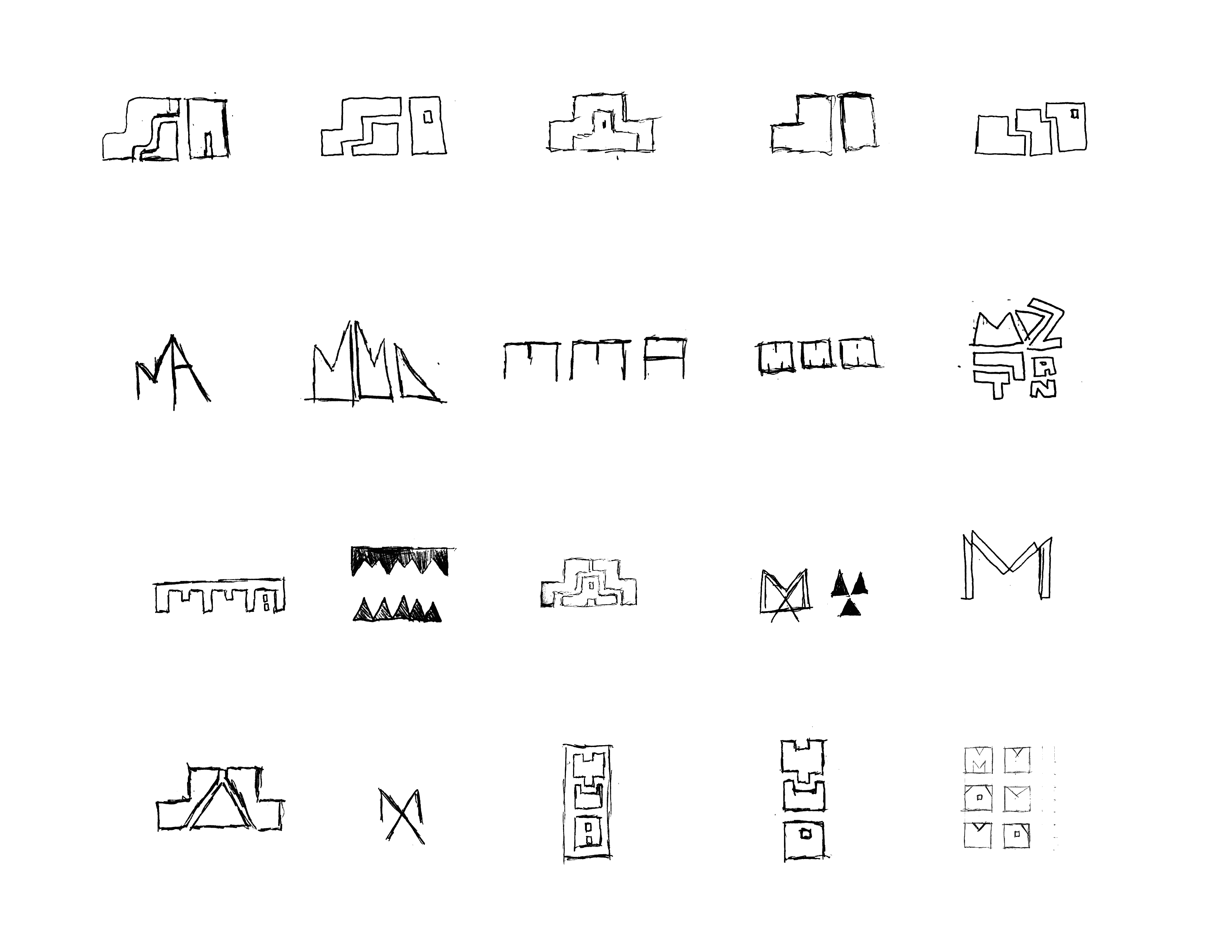
Logo Redesign Hand Sketches
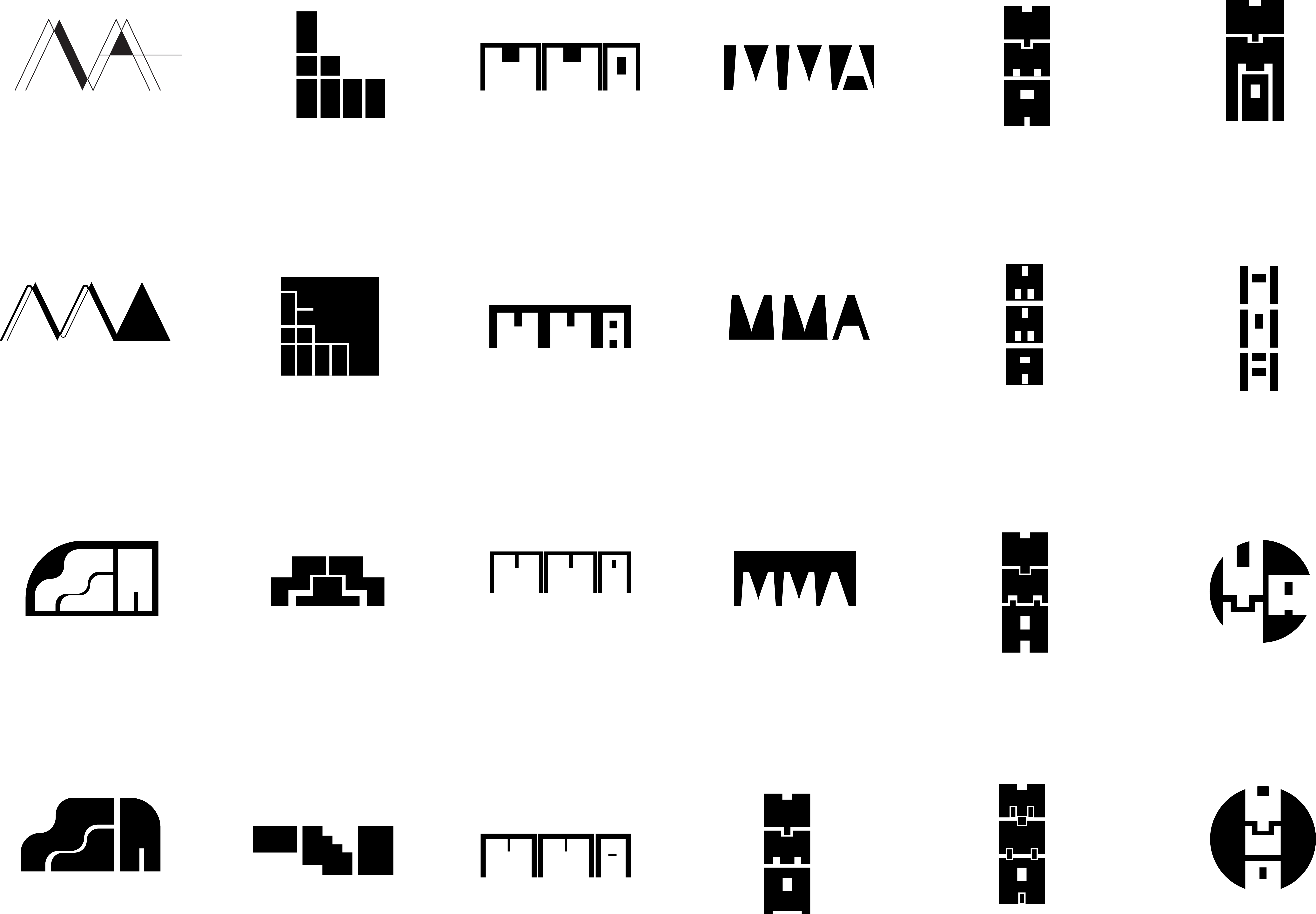
Identity Mark Exploration
Typographic Principles

Typography
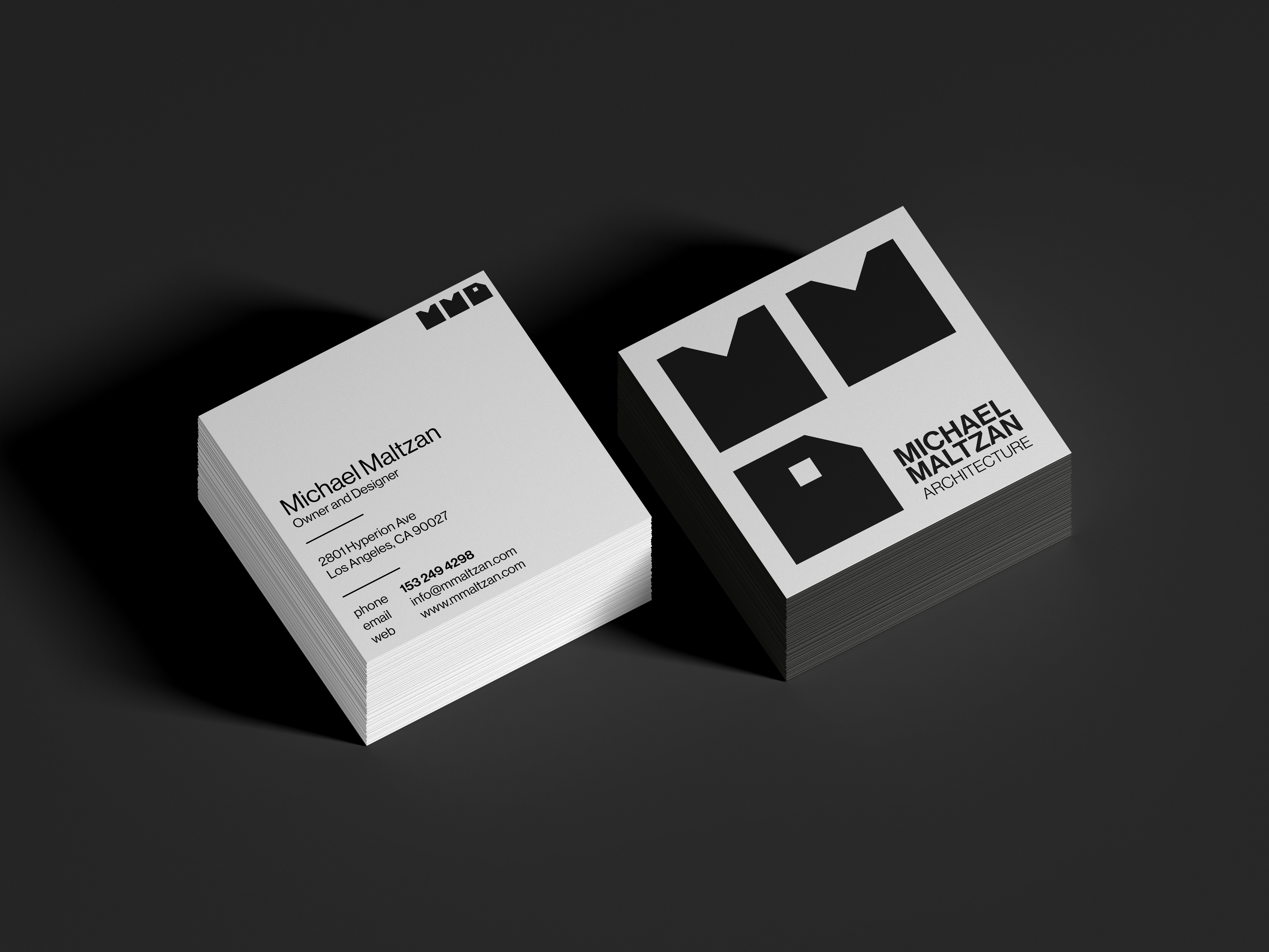
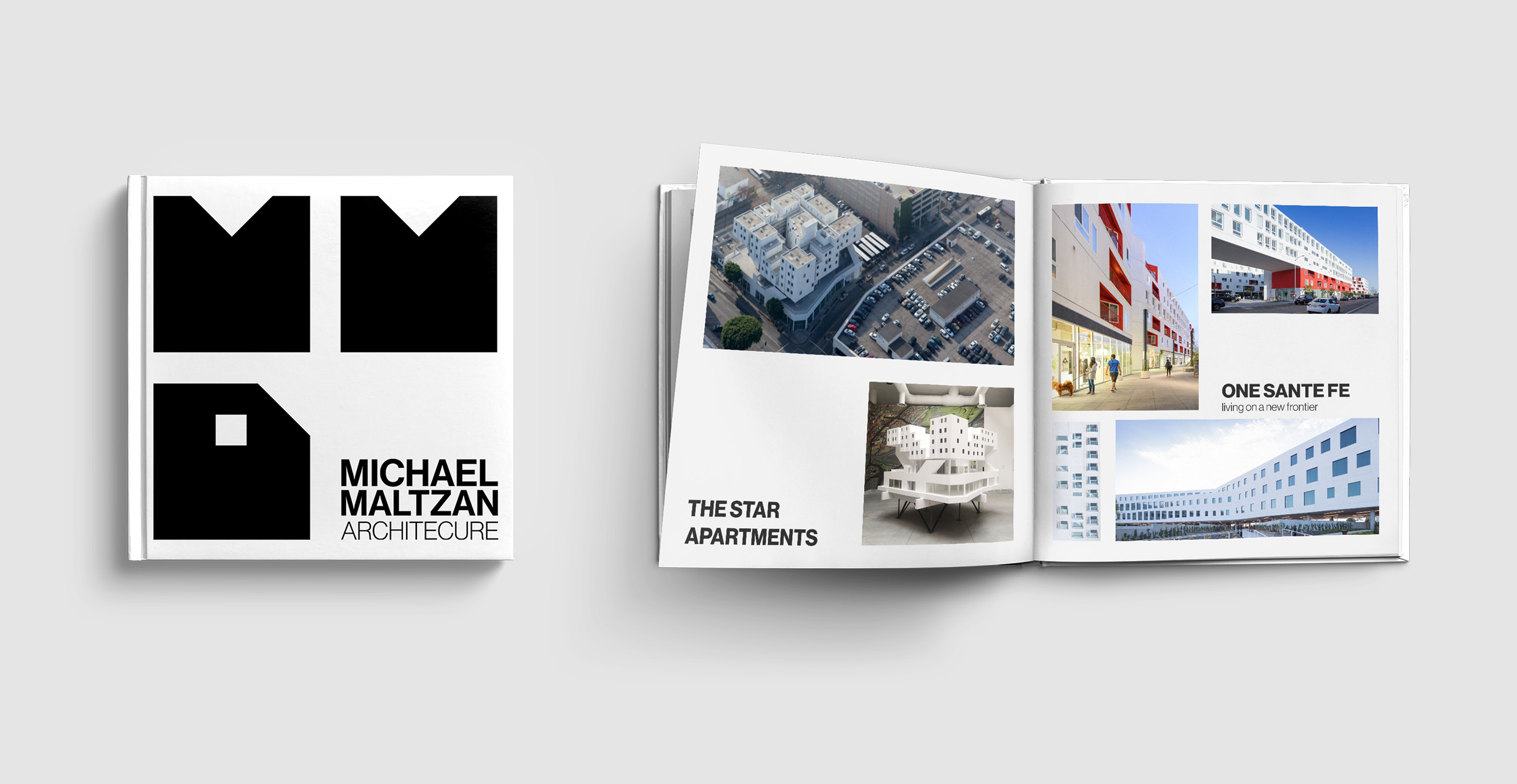
Logo Signature
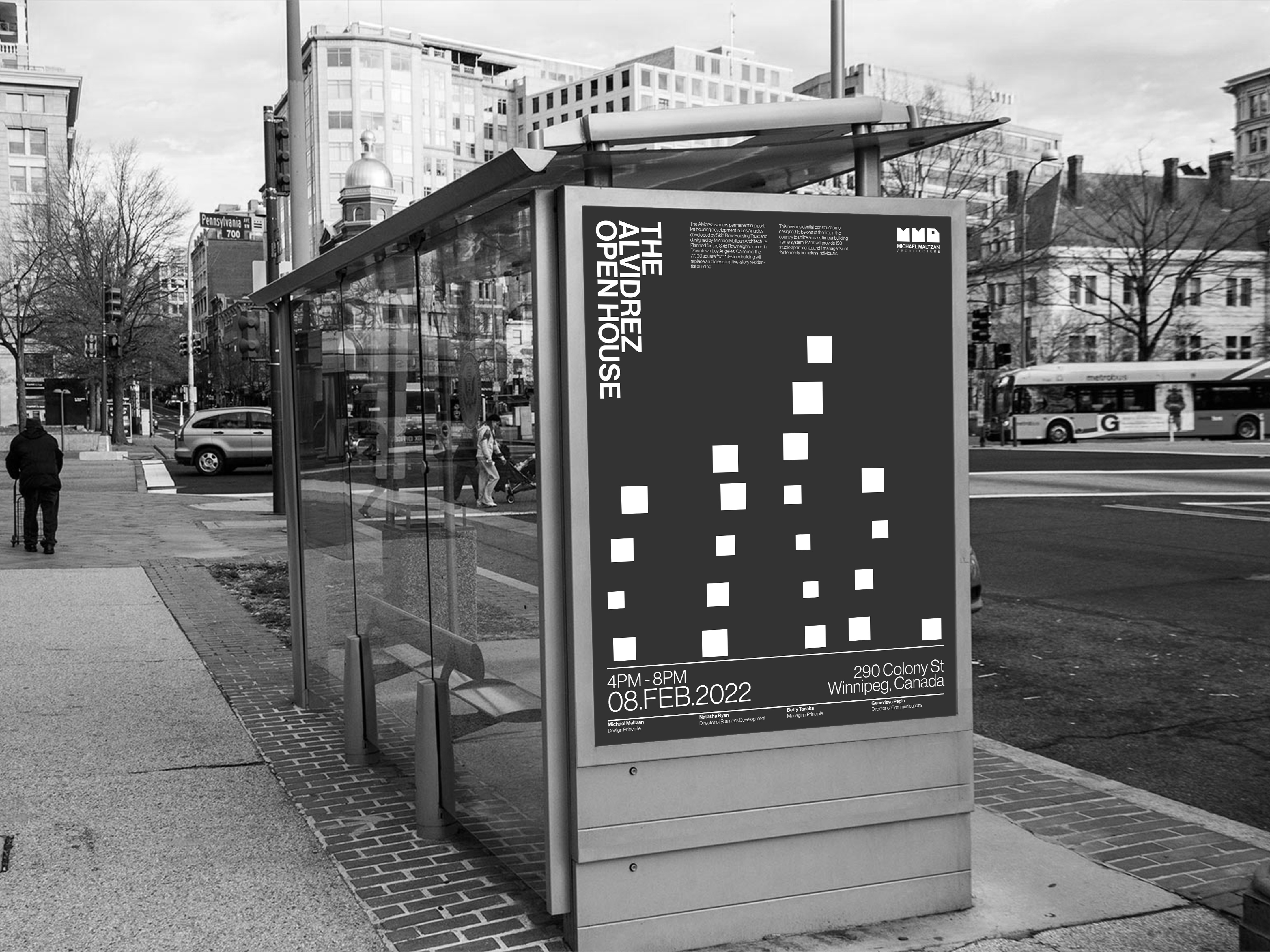
Brand Visual Elements
